MapMyRun @ UnderArmour
Map My Run by Under Armour | The best mobile run tracking experience, backed by the world's largest digital health and fitness community.
Role
Lead UX Designer
Tools
Figma, Photoshop
Team
Engineer, Scrum Master, Product Manager
Timeline
2 week sprints across the span of 1 year
MMR Challenges
Embarking on a journey with UnderArmour, I dove into the world of athletic performance, where every step, every heartbeat, and every mile counts.
The goal? To design an immersive fitness experience within the UA Record app that not only tracks but also inspires every user's fitness journey.
Platforms iOS, Android, & Web. Check it out here
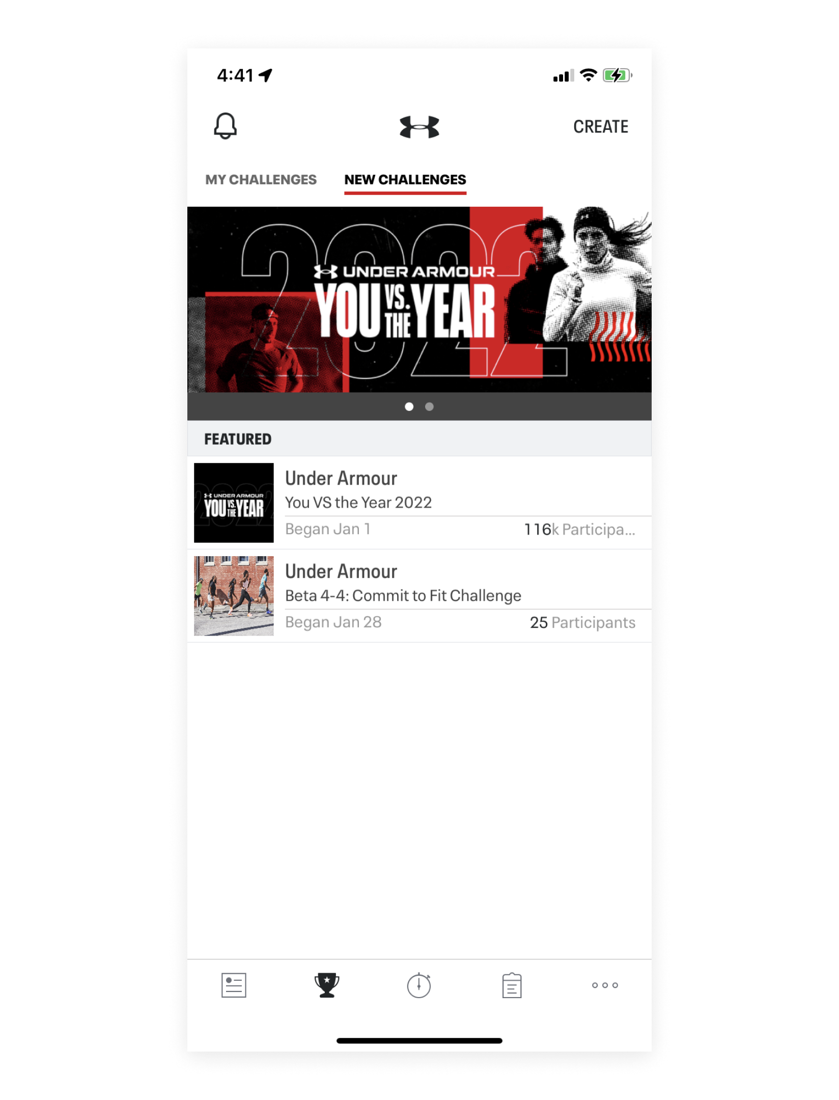
You VS The Year
ABOUT THE CHALLENGE
You VS The Year is the annual challenge we do to get our users to push past their limit. This year we were able to launch faster and earlier than we ever have because of my help and the incredible team on this project.
This competition engages an average of 3,438 participants every year. We finally found a way to make running fun!
How might we modernize and update our challenges platform?
PROBLEM
Collecting Data
RESEARCH
Collaborating closely with data analysts, we delved into the app's usage data via Amplitude. This wasn't about guesswork; it was a deep dive into hard analytics - understanding what features users loved, what they didn't, and where there was room for innovation.
The Updates
SOLUTION
Updated components based on our design system and built new components as needed
After auditing the experience, I decided maintaining cohesive card sizing would prevent us from running into issues like, very limited character length, wonky image aspect ratios, inconsistency throughout the platform, weird responsive behavior with the smaller, taller cards.
Amount of participants was found to be an important factor for joining challenges, so I prioritized it. Moved it from the leaderboard up to the details in the hero in addition to added a section for friends that are participating as well.
There was no reason to open a modal of milestones if the user has the ability to tap through all of them directly on the screen, plus causes all kinds of wonkiness on web- so removed that.
Made sure all components were expandable and responsive, the designated spot for mileage ran within the progress bar was just not going to work for longer strings of text.
Having the leaderboard scroll directly on the details page would cause issues for users with smaller screens, so I pulled it out and created a page seperate for leaderboard.
Friends Challenges
Since there was limited data regarding the friend’s side of the platform due to backend functionality issues and legacy code, the changes made to this part were made using best practice methods and a UX audit, and overall common sense. This would be the foundation in which we were to begin testing this side of the platform.
Pulled rules out of a tab and followed the same pattern as regular challenges.
Challenge type is alluded to in the header, there are four of these icons that signify the varying types, most workouts, most calories burned, most distance, etc.
Leaderboard is still prioritized in addition to your own progress compared to your competition.
Updates
TAKEAWAYS
The Results
On iOS, for users who saw the challenges home screen and then viewed a challenge-- the old design converted at 10.5% and the new design converts at 12.1%
On Android, for users who saw the challenges home screen and then viewed a challenge- the old design converted at 4% and the new design converts at 17.6%
The design is resulting in a higher join rate for You VS The Starting line! See final charts where the redesign has a 18% (Android) and 20% (iOS) improvement over the baseline (control).
Overall, the main takeaway here is that every pixel counts.
NEXT STEPS
The Loyalty Program
The next step in our journey is to launch the super exciting loyalty program. This program aims to inspire users to run more by offering rewards that can be redeemed in the Under Armour store. It's not just about tracking fitness; it's about rewarding progress and dedication, adding another layer of motivation for our users.


