Ubqfit
The first of its kind, Ubqfit serves as an innovative two-sided marketplace that connects Certified Fitness Professionals with their Trainees through live, on-demand workouts. What truly separates this young start-up from the pack is the social training & monetization features built into the app’s live-streamed sessions. Think "Uber meets Twitch.tv."
Role
Lead UX Designer
Tools
Figma, Photoshop
Team
UX Researcher
Timeline
1.5 months
Brief
Ensuring that the app's social features are discoverable and intuitive.
Deliverables
App audit, a high fidelity prototype that covered the entire booking flow and concepts for the rest of the app, and a design system
PROBLEM
How might we encourage users to book more sessions?
OUR APPROACH
Well, let’s start by observing the users.
(In the least creepy way possible)
It was vital that our team explore why new users were disengaging from the app before understanding its social & monetization features.
Our methods:
App Audit
App Usability Testing
Competitive Research
As we collected our data, we noticed that themes began emerging. These themes didn’t necessarily point directly to user issues with the app’s booking flow. Instead, they further highlighted that an unintuitive app flow led to user frustration and drop off before they entered the payment flow.
No Information
A lack of information required to make informed purchase decisions.
Low Quality
A lack of trust instilled due to low quality images or videos.Paywall
An unbalanced sense of value provided measured against the paywall.
Social Proof
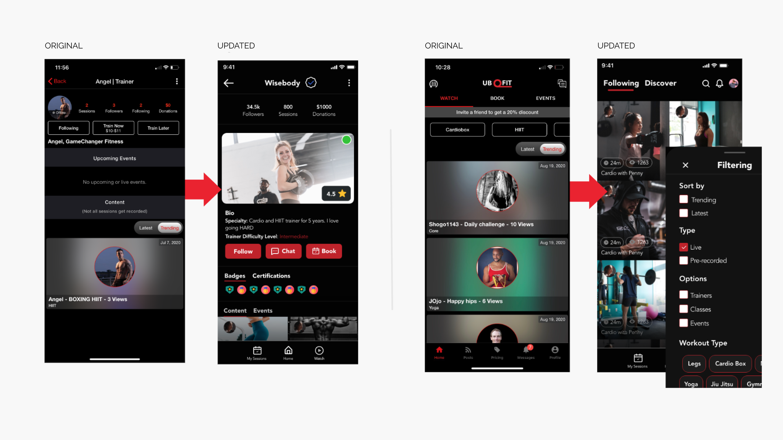
Added star ratings, followers, and session count. Reorganized recorded content.UI Update
Profile image size was increased and quality improved to boost first impressions.Information
Trainer bio now includes workout specializations, badges, certifications, & trainer workout intensity.
Defining the solution
Through 2 rounds of testing the existing product & our own prototypes on 10 users, involving the stakeholder in an a ideation workshop, various iterations of prototyping, and secondary research- we discovered that there were three main aspects of the app that could be optimized to increase user retention.


Prototyping
In order to answer to the problems outlined above, we began to throw some low/mid fidelities together. We tested different variations of layouts and hierarchy of information. We found that the best way to prioritize both the user AND business needs were to…
Show off what we got
The existing app, due to backend issues, is slow to load some screens. We took that opportunity to inform the user of all the app’s featuresBooking starts with…what? who? when?
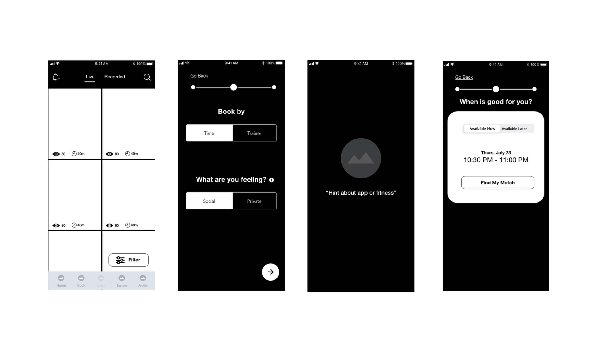
We ideated different versions of the booking flow, but decided on having it begin with fitness type. Why? One reason is if the user were to have a certain coach in mind, the user would primarily search them and book from profile.Finding the important stuff
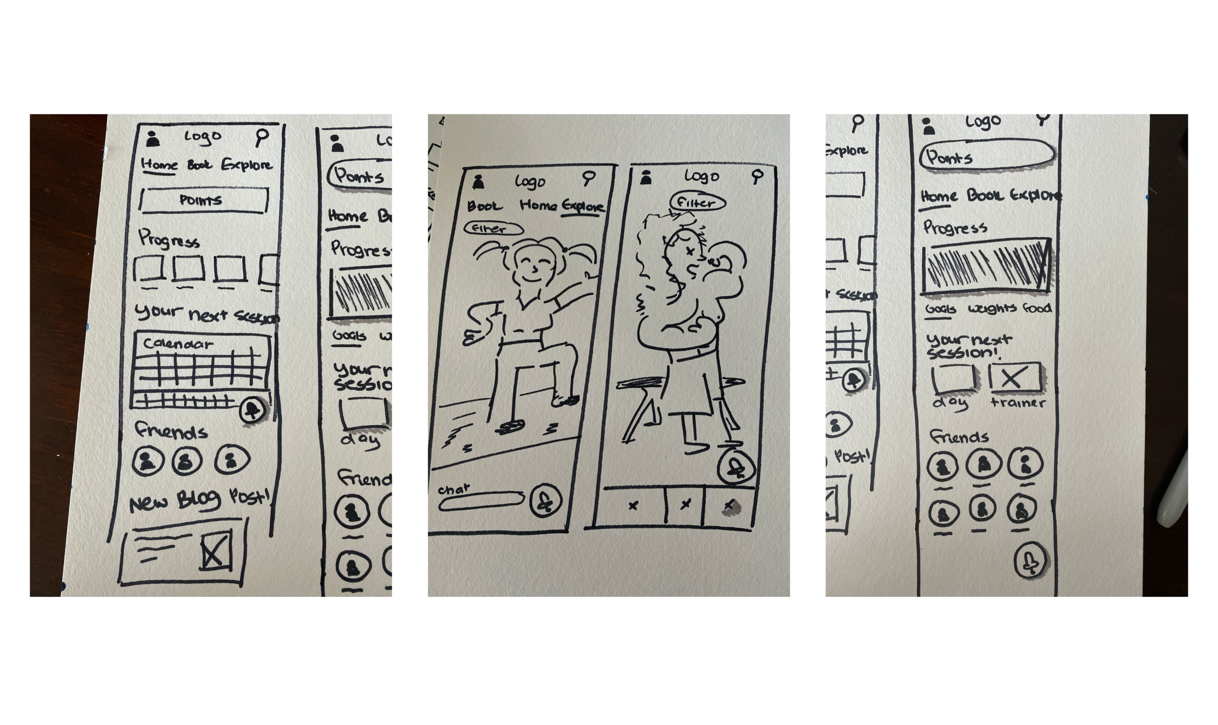
The navigation was very confusing to the users we tested on, so ideating variations based on appropriate and best practice hierarchy was necessary.
“Showing your friends on the front page makes more sense. Having a friend on there gives you the urgency to want to continue.”
Users preferred to have their progress and fitness data shown immediately upon opening the app. Adding friendly competition through gamification intrinsically motivates users to work harder and pushes them to engage with the app.
The Results
Users loved the idea of being able to view their friends and compete against them.
Users felt most comfortable landing on the Activity page vs the Watch
Separating the booking into individual screens improved the overall clarity and provided a smoother user flow.
Users preferred to see social proof prioritized over income stats on profiles.
“I just want to get my ass kicked and do jiu jitsu.”
Users want to know the difficulty level of the upcoming training session. Many base their decisions on the intensity of the session within its time frame.
Takeaways
In order to answer to the problems outlined above, we began to throw some low/mid fidelities together. We tested different variations of layouts and hierarchy of information. We found that the best way to prioritize both the user AND business needs were to…
User friendliness
Added star ratings, followers, and session count. Reorganized recorded content.Sense of trust
Profile image size was increased and quality improved to boost first impressions.Transparency
Trainer bio now includes workout specializations, badges, certifications, & trainer workout intensity.
Questions left to explore...
How might we design an intuitive search flow?
How might we use gamification to design a Wallet feature?
How might we design user profiles and/or a personalized home screen to boost engagement and app retention? (Two separate sprints)
How might we design a Donations flow that promotes altruism?
How might we design the Instant book flow?
How might we design an intuitive Social Leaderboard that encourages competition?


